Building the Work.ua Mobile App: Designing a Scalable Product from the Ground Up
This case study covers my work on the Work.ua mobile application, from early planning to the first public release. It focuses on how an existing web product was translated into a native mobile experience, how key candidate flows were simplified, and how design decisions were shaped by data, usability testing, and business goals. The project highlights my approach to product design at scale, cross-functional collaboration, and measuring success through real user and business outcomes.
Product Overview
Work.ua is the largest job search platform in Ukraine. I worked on the design of the mobile application, focusing on UX, key candidate scenarios, and alignment with business metrics.
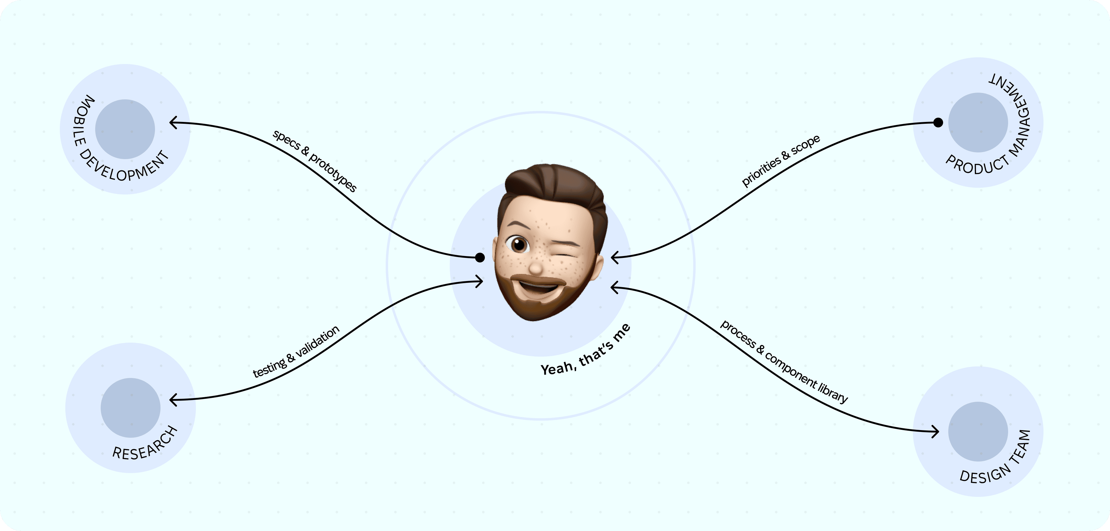
The project was developed from 2019 to 2020, from planning to the first release. I worked with a team of 3–4 designers and later became the Head of Design. I helped establish communication and build a shared strategy together with the mobile development team (Flutter), the product manager, and the backend team responsible for the API.
Product Context & Scale
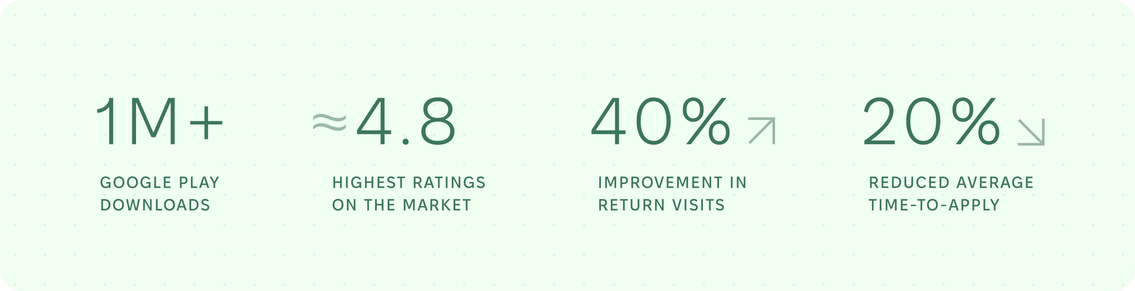
After launch, the monthly audience reached 400K+ MAU. The application addressed the needs of one side of the marketplace — job candidates.
The product monetizes exclusively through companies that are hiring, so the business model depends on attracting and retaining a large pool of candidates with high-quality resumes.
The main goals and metrics were reducing time to apply, enabling fast communication with companies via push notifications, improving user return rates, and building a long-term product ecosystem.
Problem Space
One of the main problems before launching the app was slow communication, limited privacy, and the lack of effective notification and re-engagement tools such as push notifications. At the same time, organic audience migration from desktop to mobile reached a critical point of around 70%, clearly indicating that the usage paradigm had changed.
This shift created an opportunity to significantly improve the experience by leveraging native mobile capabilities.
Role & Responsibilities
I was responsible for UX research, prototyping, validating design solutions, and collaborating closely with the product and development teams. I participated in strategic planning of the design and development process, helped build the component library, and organized the design team’s workflow. I also facilitated collaboration between the design and mobile development teams.
Together with the team, I conducted an extensive competitor analysis, created a comparative overview, and built an implementation plan with baseline decisions:
- platform-specific styles, typography, and components,
- navigation structure and core screens,
- a general approach to accessibility features.
Research & Key Insights
I analyzed how key competitors design the job application flow in mobile apps, focusing on the number of steps, friction points, and the moments when users make decisions.
We were fortunate to have a strong foundation before starting mobile development, as we already had a mature web product, including a mobile web version. This allowed us to rely on existing data while accounting for platform differences and new interaction patterns.
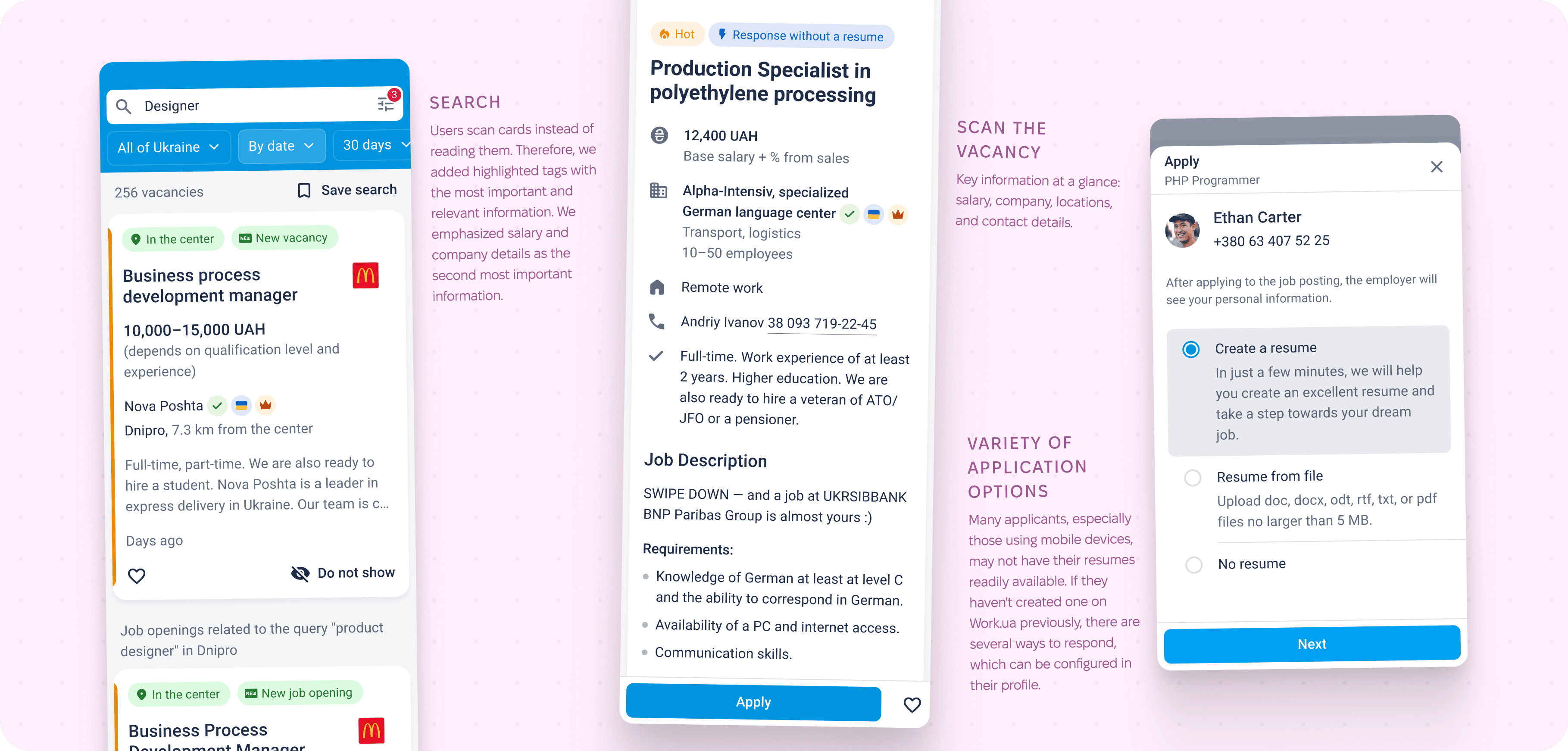
During corridor usability testing, we discovered that candidates tend to scan information rather than read it thoroughly. As a result, we aimed to make the interface intuitive and easy to understand, avoiding large blocks of text.
Our web experience was extremely helpful. I reused user journey maps created for the web version while adapting them to mobile platforms. For people searching for jobs, three attributes are critical: salary, location, and work format (remote, office, hybrid). These had to be the most visually prominent.
I often follow the principle “the fewer clicks, the better.” Another good practice is collecting as much useful information as possible without forcing users to type extensively. Therefore, the focus was on simplifying input and improving clarity. I actively searched for relevant patterns and antipatterns in competitor solutions.
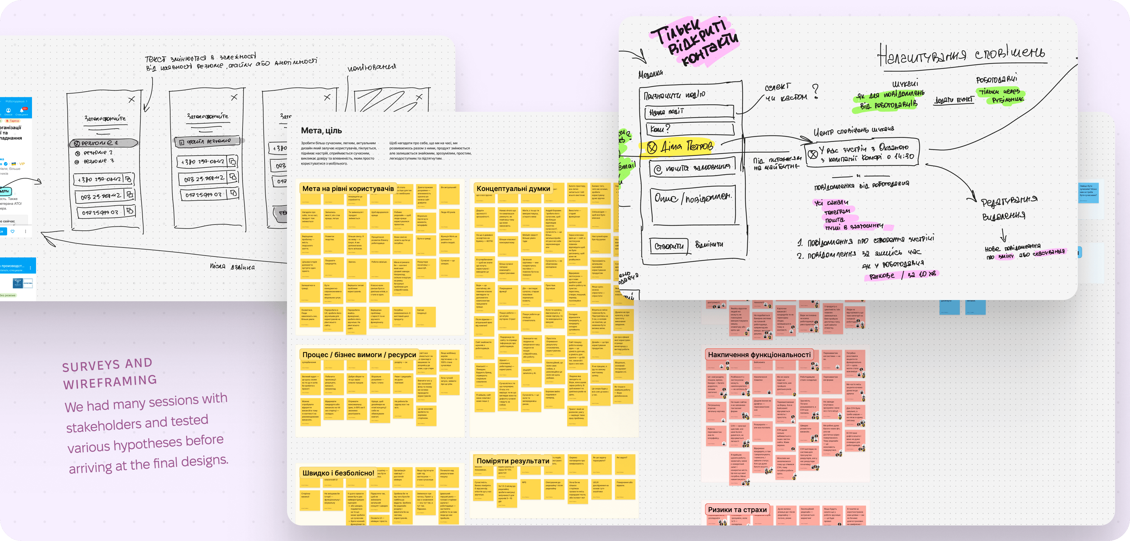
Hypothesis Formation
Together with the team, we formed multiple hypotheses based on the data we gathered. We analyzed large datasets and funnels from the mobile web version, including registration, job applications, saving jobs, and resume creation.
Our main hypothesis was to keep the overall application structure largely unchanged. For existing users, it was important to arrive in a familiar environment where patterns from the website (especially the mobile version) remained recognizable. Therefore, the general screen structure needed to feel consistent.
At the same time, navigation had to follow native mobile platform standards so that both new and returning users could rely on established interaction patterns.
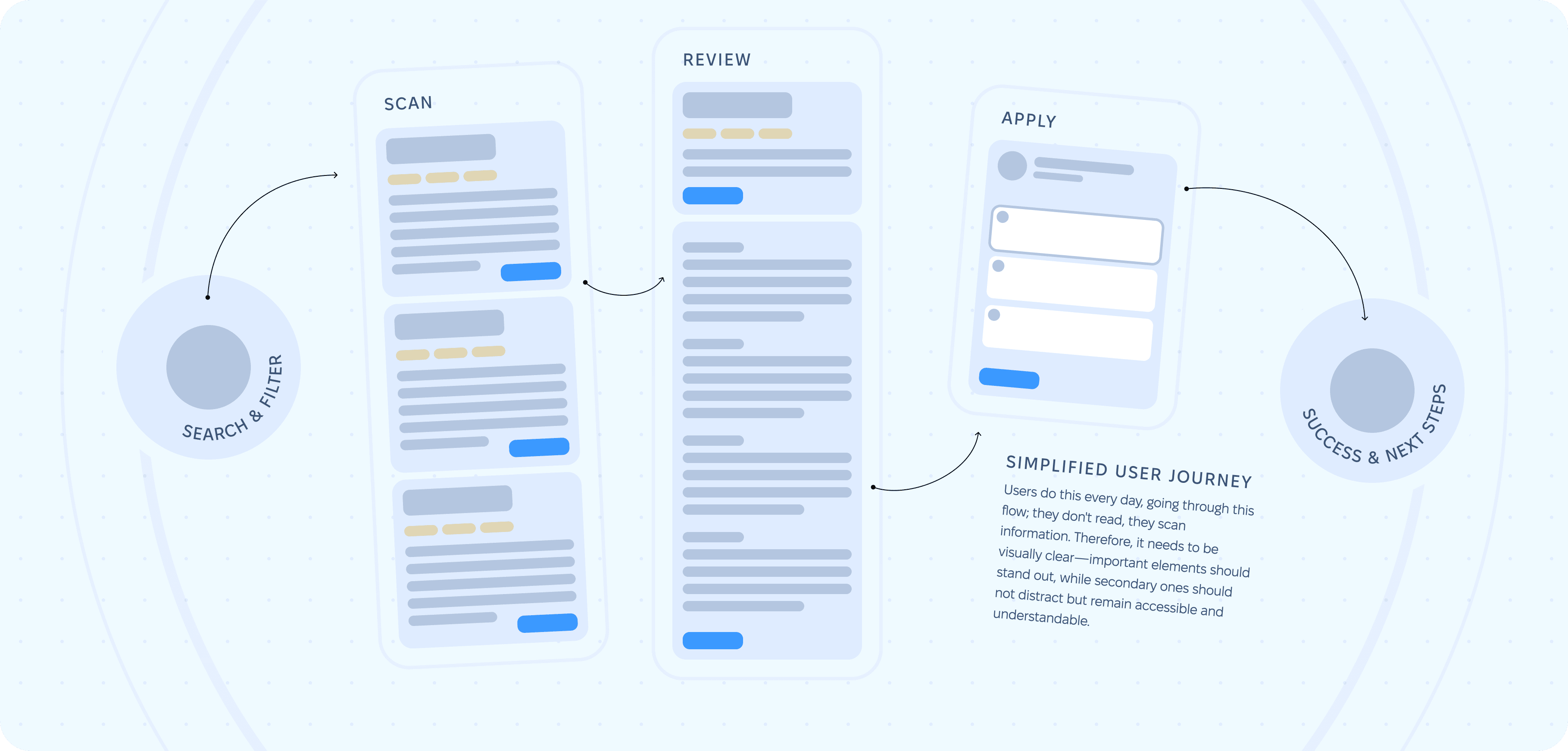
Another hypothesis was that each screen should present a small, cognitively easy-to-process chunk of information, allowing users to move forward quickly — without introducing too many steps. This was especially important in application, registration, and onboarding flows.
One more hypothesis was to move key job attributes higher and emphasize them to speed up application decisions. These attributes were salary, location, and employment type.
Design Solutions
Navigation Strategy
During research, I noticed that many apps misuse the tab bar by treating it as an action container rather than a navigation tool, despite platform guidelines stating otherwise:
Use a tab bar to support navigation, not to provide actions. A tab bar lets people navigate among different sections of an app. If you need controls that act on elements in the current view, use a toolbar instead.
While iOS and Android standards have evolved, some principles remain unchanged. I strongly believe platform components should be used for their intended purpose, though exceptions do exist.
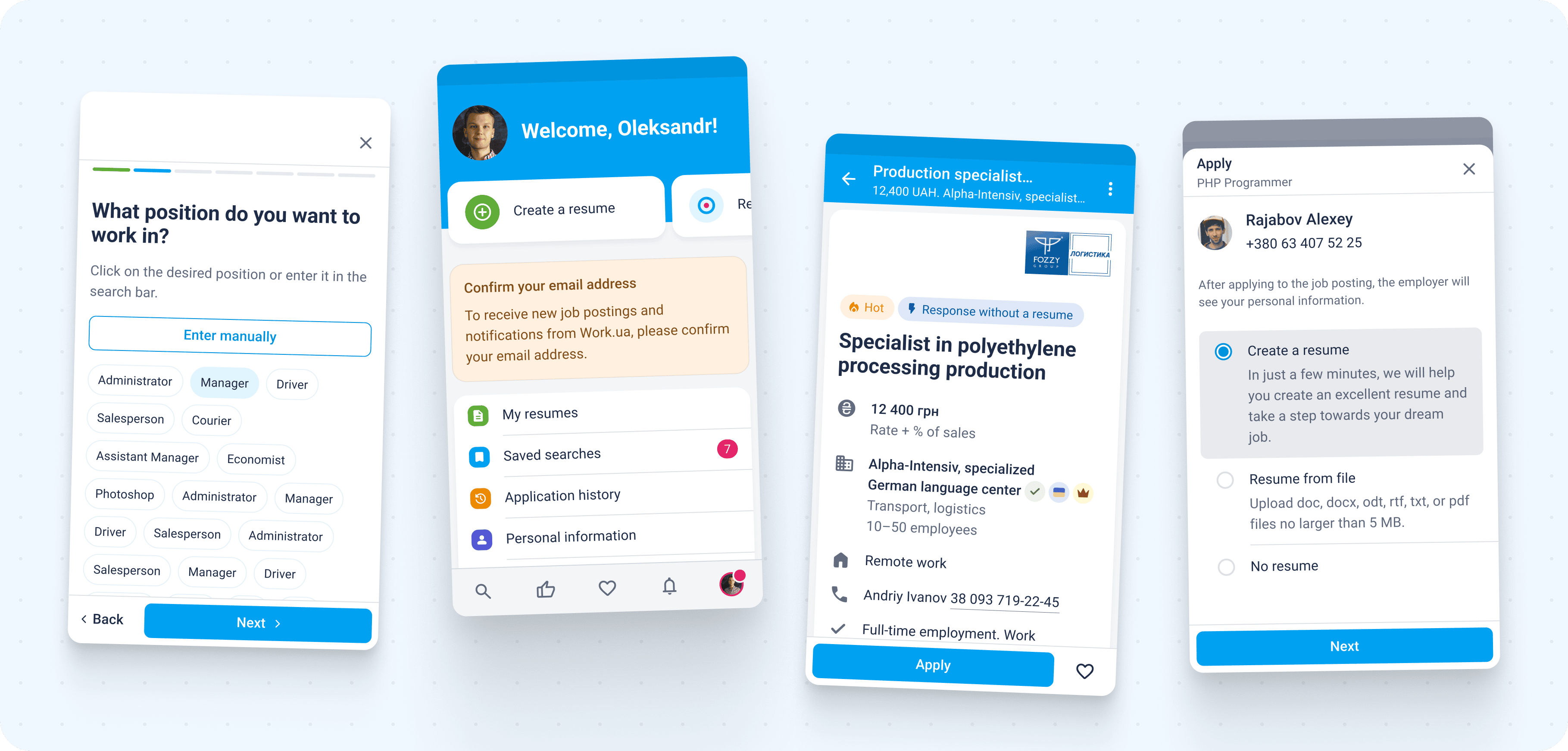
One challenge was selecting the most valuable tab bar items. Search and filters combined with job listings were essential. The user profile, containing resume data, was another key section. Notifications were also critical, as they were one of the main reasons for building the app, though they were introduced later.
At the time, placing a “create content” button in the tab bar was a common pattern. The team was divided on this decision. I was against it, as resumes are not created frequently — most users need only one, occasionally two or three, based on site statistics.
I proposed showing this button only to new users and later moving it into the resume list within the profile. This solution satisfied everyone. Eventually, the button was removed from the tab bar entirely and remained only in the profile section.
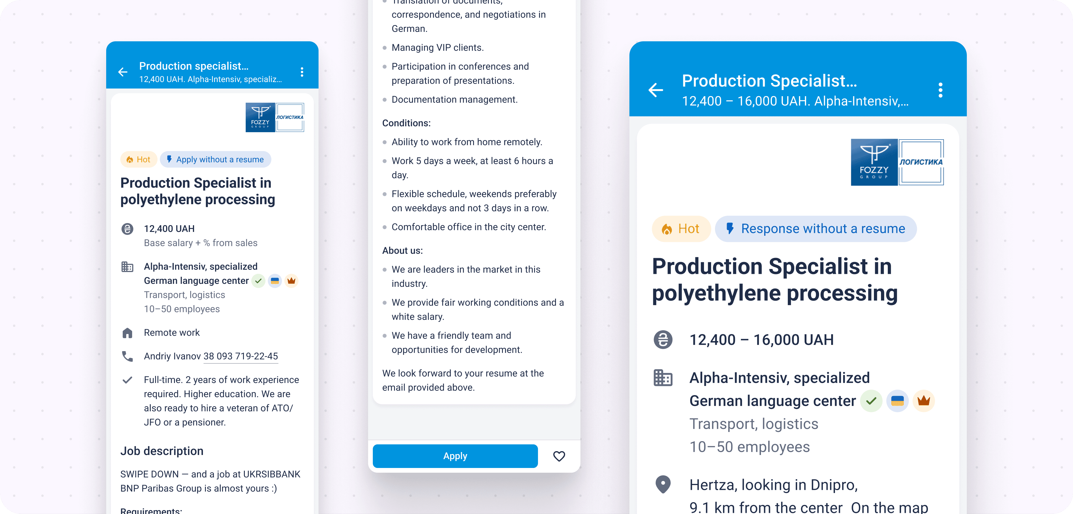
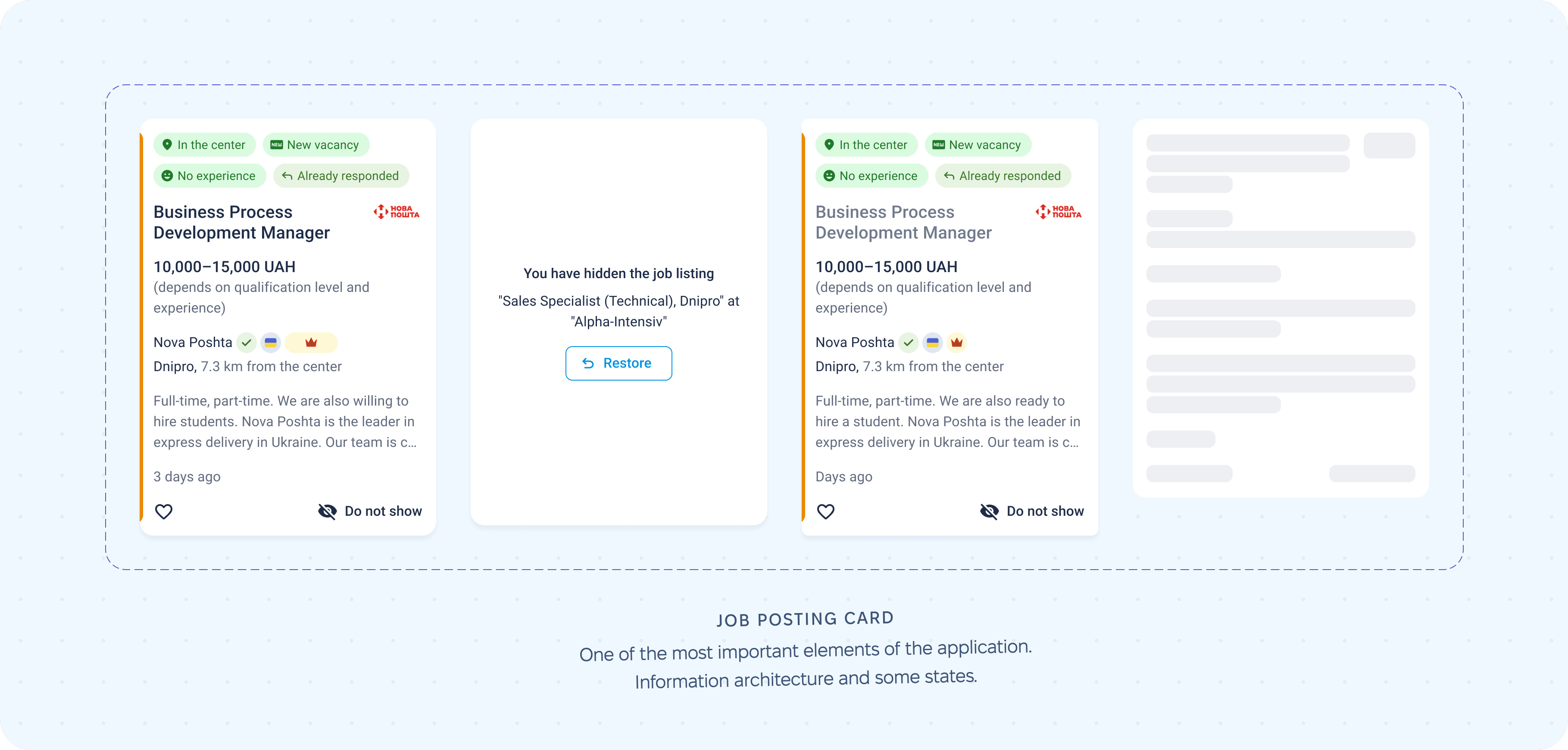
Job Card Design
This is one of the most critical elements of both the website and the app. We already had a well-developed job card on the web, so the task was to adapt it to mobile screens while keeping it familiar to users. Decisions were informed by web analytics, heatmaps, and click maps.
Search & Filters
Filters needed to match those used on the website. My task was to define how users would access and interact with them. We chose a familiar pattern: on iOS, full-screen bottom modals (later evolving into stacks), and on Android, bottom sheets that could expand to full screen.
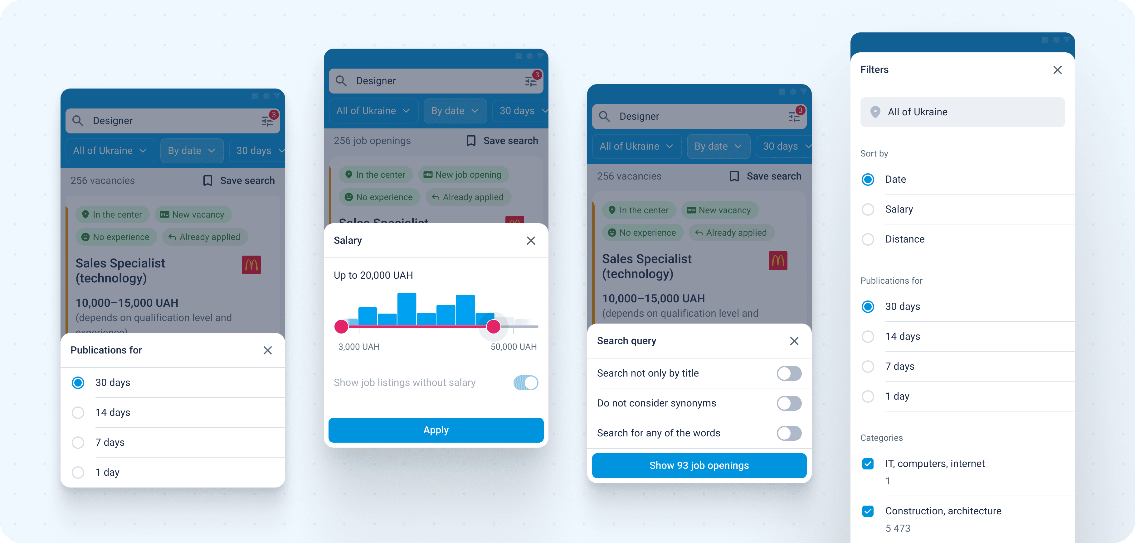
We also introduced quick filters displayed above search results. Frequently used filters were immediately visible, while others were hidden behind horizontal scrolling or a modal trigger. This solution proved convenient and was supported by usage data.
Saving Jobs & Applying
This is one of the most important activation moments in the app. When a candidate either applies to a job or saves it to favorites, it is considered a success.
We added a heart icon to the job card to save jobs. Existing users were already familiar with this pattern from the website. For new users, after saving a job, we showed a shortcut to the favorites section so they could immediately understand where saved jobs live.
Empty states were also carefully designed to explain the purpose of each screen, guide users toward action, and help them learn and remember navigation paths.
Collaboration with Engineering
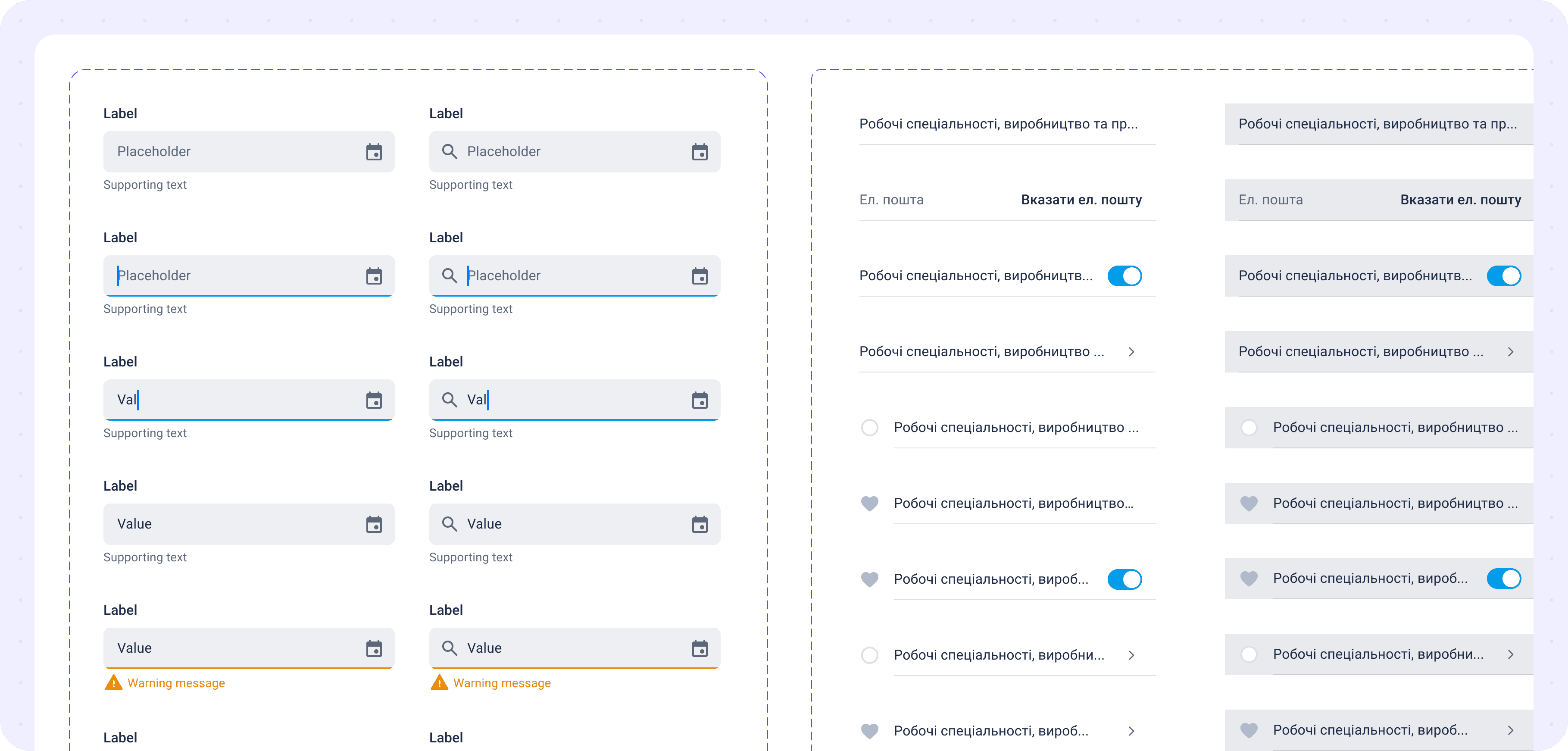
At the time, we were still working in Photoshop, but for the app we switched to Sketch, which was a very progressive tool for interface design and file management. However, advanced sharing integrations were still limited. I already had experience with Sketch and Zeplin — a service that allowed developers to inspect layouts, measurements, and assets, similar to today’s Figma Dev Mode. This solution significantly improved collaboration and sped up development. Later, we transitioned to Figma, which further streamlined the process.
The app was built using Flutter. We agreed with the development team to keep a shared foundation across platforms while respecting native differences. Typography, modals, confirmations, alerts, bottom sheets, and action sheets remained native to each platform.
Results & Impact
After launch, the app was quickly adopted by users. We tracked active user trends, which grew exponentially, reaching 400K+ MAU in a short period.
We compared funnel performance across desktop, mobile web, and mobile apps. Key metrics included registrations, saved jobs, application conversion, and resume creation. Since this was the first app release, we benchmarked against web and mobile web data. Initially, users moved through core funnels smoothly with no major issues.
In later releases, we tracked specific paths and continuously optimized them. Application conversion increased by 5–10% month over month due to incremental improvements to an already optimized flow. We measured each step, identified drop-off points, generated hypotheses, ran A/B tests, and selected variants with lower bounce rates.
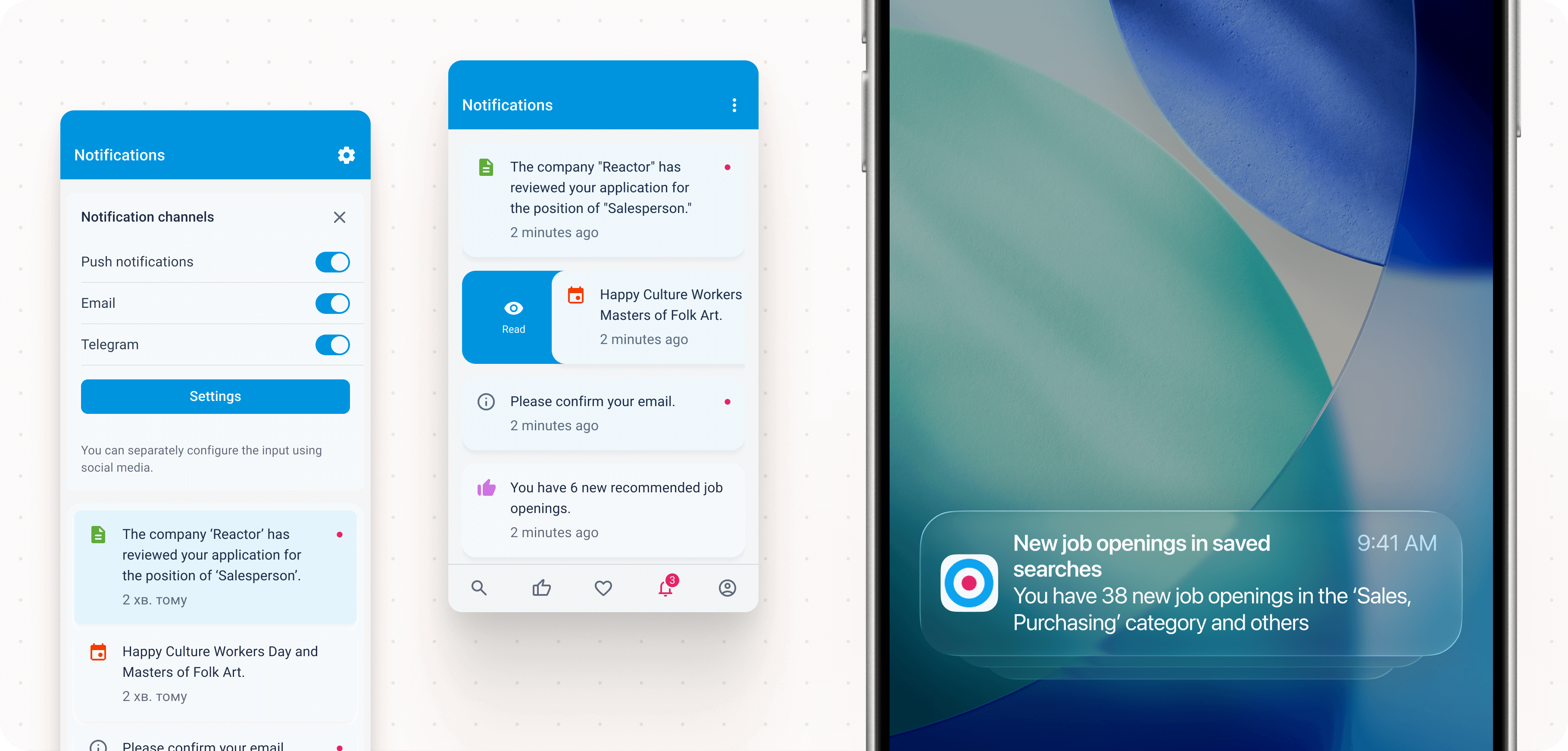
User return was our primary goal. Our push notification system significantly outperformed the website in terms of re-engagement. While email worked well on the web, not all job seekers actively use email. Push notifications became a highly effective new communication and retention channel.
Key Learnings & Reflection
This was a large and highly responsible project. Before the team started working on it, the product simply did not exist. Bringing it to life was both challenging and rewarding.
I learned that planning — especially at the beginning of a large project — is critical. Early decisions have a long-lasting impact, and mistakes become increasingly difficult to fix over time. This reinforced the importance of careful research, strategy, and choosing proven, simple approaches.
I learned how to build complex systems from scratch, use web data to inform mobile decisions, differentiate between iOS and Android experiences, and successfully pass app store reviews under tight deadlines.
Looking back, I would invest more time in early research and planning. In later projects, as a design lead, I introduced structured design processes and conducted interviews with users and stakeholders. In this project, I would emphasize that phase more strongly at the start.
Despite this, we delivered the app relatively quickly — the full site functionality was available in the app in under a year, from planning to store release. Today, I would approach it differently by starting with a smaller MVP focused on core needs such as communication and job applications, then gradually expanding features. This would allow for earlier feedback, faster hypothesis validation, and more controlled resource usage.
This project changed how I think. I moved from focusing on individual screens or flows to considering broader systems, strategies, and long-term product impact. I learned that attention to detail and critical thinking may not always show immediate results, but over time they prevent serious issues and significantly improve product quality.
Next Steps
I enjoy working on products that achieve measurable results. I care about outcomes backed by data, not intuition. I work fast, thoroughly, and closely with users to understand real needs and improve products based on facts rather than assumptions.
If this approach resonates with you, I would be happy to discuss potential collaboration. Write to me ›